
The 2019 Top 3 of bad data graphics

— This figure was very much appreciated for being an unintelligible colorful spaghetti mash-up. It is close to impossible to compare the different trend lines, let alone merely distinguish the different color-coded cities. This would be a prime candidate for a Tufte-style "small multiples" redesign.

— The figure above is a visualization where the data disappeared from the screen and was sacrificed to an unstoppable desire to represent everything on an unnecessary geographical country map. This unfortunate choice gave rise to all kinds of unintended consequences and false impressions: the Asian population disappeared in the USA in 2010, we are expecting an alien invasion ("other") in 2060, the percent of black and Hispanic in the total population appears to drop although the numbers increase or stay the same, and all non-white citizens are living in the north of the country.
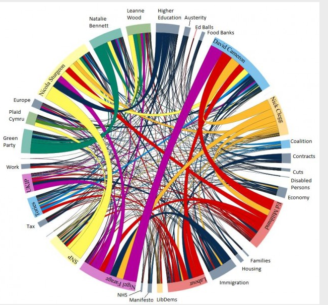
— The last figure in our top 3 is a currently popular style of infographic to represent relations between many variables, here applied in a UK context. Yes, it is a colorful maze or network, but our biggest problem with this one was annotation: The graphic itself is lacking any indication of what is actually represented. Does the color-coding have any meaning? Does the ordering in the circle have any meaning? The size of the link is a function of what data? A link has a variable size through the network and projecting to compare surfaces is one of the more difficult perceptual operations for a human.
Visual representation an important communication tool
Braeken concludes:
Visual representations of data & statistical modeling results are the communication tool par excellence in our field. It is only logical that we should pay attention to develop proper visualizations that raise questions by facilitating comparisons and that provide answers by making the data stand out! Yet, recognizing what is bad practice is perhaps the easiest part, now we need to try and deliver good graphics ourselves.